class: center, middle, inverse, title-slide # ASP 460 2.0 Data Visualization ### Dr Thiyanga Talagala ### Visualizing Time Series Data --- # Individual Time Series: Points .pull-left[ ```r library(mozzie) library(ggplot2) data(mozzie) colombo.dengue <- mozzie[, 1:4] ggplot(colombo.dengue, aes(x=ID, y=Colombo))+ geom_point()+xlab("Time")+ ylab("Number of dengue cases") ``` ] .pull-right[  ] --- # Individual Time Series: Points .pull-left[ ```r library(mozzie) library(ggplot2) data(mozzie) colombo.dengue <- mozzie[, 1:4] ggplot(colombo.dengue, aes(x=ID, y=Colombo))+ geom_point()+xlab("Time")+ ylab("Number of dengue cases") ``` This is NOT a scatter plot. Why? ] .pull-right[  ] --- # Individual Time Series: Points .pull-left[ **This is NOT a scatter plot. Why?** - the points are spaced equally along the x-axis. - there is a order among points. To emphasize time dependent relationship we can connect neighboring points with lines. ] .pull-right[  ] --- # Individual Time Series: Points and Lines .pull-left[ ```r library(mozzie) library(ggplot2) data(mozzie) colombo.dengue <- mozzie[, 1:4] ggplot(colombo.dengue, aes(x=ID, y=Colombo))+ geom_point()+ * geom_line()+ xlab("Time")+ ylab("Number of dengue cases") ``` ] .pull-right[  ] --- # Individual Time Series: Points and Lines .pull-left[ - Lines do not represent observed data. Lines are meant as a guide to the eye. - If few observed values a far apart or unevenly spaced, it is not suitable to connect points with lines. ] .pull-right[  ] --- ## Individual Time Series: Lines only .pull-left[ ```r ggplot(colombo.dengue, aes(x=ID, y=Colombo))+ * geom_line()+ xlab("Time")+ ylab("Number of dengue cases") ``` ] .pull-right[  ] --- ## Individual Time Series: Lines only .pull-left[ - Without points more emphasis is given on the overall trend and less on individual values. - In general, when there are too many points it is better to plot without points. ] .pull-right[  ] --- ## Individual time series: Fill the area under the curve .pull-left[ ```r ggplot(colombo.dengue, aes(x=ID, y=Colombo))+ * geom_area()+ xlab("Time")+ ylab("Number of dengue cases") ``` ] .pull-right[  ] --- .pull-left[ - Visually separates the area above and below the curve. - More emphasis is given to the overarching trend in the series. - This visualization is only valid if the y axis starts at zero. ] .pull-right[  ] --- # Visualising multiple time series .pull-left[ 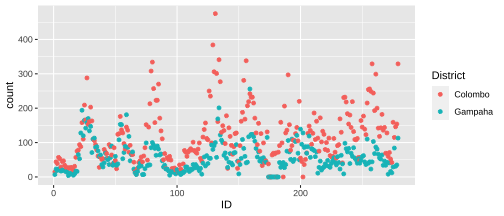<!-- --> Difficult to read. ] .pull-right[ <!-- --> By connecting points with lines we help the reader to follow the paths of each individual time series. ] --- # Smoothing ```r library(gapminder) head(gapminder) ``` ``` ## # A tibble: 6 x 6 ## country continent year lifeExp pop gdpPercap ## <fct> <fct> <int> <dbl> <int> <dbl> ## 1 Afghanistan Asia 1952 28.8 8425333 779. ## 2 Afghanistan Asia 1957 30.3 9240934 821. ## 3 Afghanistan Asia 1962 32.0 10267083 853. ## 4 Afghanistan Asia 1967 34.0 11537966 836. ## 5 Afghanistan Asia 1972 36.1 13079460 740. ## 6 Afghanistan Asia 1977 38.4 14880372 786. ``` --- # Smoothing .pull-left[ ```r library(tidyverse) gapminder_af <- gapminder %>% filter(continent == "Africa") ggplot(gapminder_af, aes(x=year, y=lifeExp))+ geom_point()+ geom_line()+ facet_wrap(~country) ``` ] .pull-right[ <!-- --> ] --- # Smoothing .pull-left[ ```r gapminder_af <- gapminder %>% filter(continent == "Africa") ggplot(gapminder_af, aes(x=year, y=lifeExp))+ geom_line()+ facet_wrap(~country)+ theme(axis.text.x = element_text(angle = 90, hjust = 1)) ``` ] .pull-right[ <!-- --> ] --- # Smoothing .pull-left[ ```r library(tidyverse) gapminder_af <- gapminder %>% filter(continent == "Africa") ggplot(gapminder_af, aes(x=year, y=lifeExp))+geom_smooth()+facet_wrap(~country)+ theme(axis.text.x = element_text(angle = 90, hjust = 1)) ``` ] .pull-right[ <!-- --> ] --- # Time series plots .pull-left[ ```r library(forecast) library(fpp2) mozcol <- ts(mozzie$Colombo, frequency = 52, start = c(2008, 52)) autoplot(mozcol) + ggtitle("Dengue Count - Colombo") + ylab("Count") + xlab("Year") ``` ] .pull-right[ <!-- --> ] --- # Seasonal plots .pull-left[ ```r ggseasonplot(mozcol, year.labels=TRUE, year.labels.left=TRUE) + ylab("Count") + ggtitle("Seasonal plot: Dengue Count - Colombo") ``` ] .pull-right[ <!-- --> ] --- # Polar seasonal plot .pull-left[ ```r ggseasonplot(mozcol, polar=TRUE) + ylab("Count") + ggtitle("Polar seasonal plot: Dengue Count - Colombo") ``` ] .pull-right[ <!-- --> ] --- # Time series plot .pull-left[ <!-- --> ] .pull-right[ <!-- --> ] --- # Seasonal plot .pull-left[ ```r ggseasonplot(a10, year.labels=TRUE, year.labels.left=TRUE) + ylab("$ million") + ggtitle("Seasonal plot: antidiabetic drug sales") ``` ] .pull-right[ <!-- --> ] --- # Polar seasonal plot .pull-left[ ```r ggseasonplot(a10, polar=TRUE) + ylab("$ million") + ggtitle("Polar seasonal plot: antidiabetic drug sales") ``` ] .pull-right[ <!-- --> ] --- # Seasonal subseries plots .pull-left[ ```r ggsubseriesplot(a10) + ylab("$ million") + ggtitle("Seasonal subseries plot: antidiabetic drug sales") ``` ] .pull-right[ <!-- --> ] --- ```r a10 ``` ``` Jan Feb Mar Apr May Jun Jul 1991 3.526591 1992 5.088335 2.814520 2.985811 3.204780 3.127578 3.270523 3.737851 1993 6.192068 3.450857 3.772307 3.734303 3.905399 4.049687 4.315566 1994 6.731473 3.841278 4.394076 4.075341 4.540645 4.645615 4.752607 1995 6.749484 4.216067 4.949349 4.823045 5.194754 5.170787 5.256742 1996 8.329452 5.069796 5.262557 5.597126 6.110296 5.689161 6.486849 1997 8.524471 5.277918 5.714303 6.214529 6.411929 6.667716 7.050831 1998 8.798513 5.918261 6.534493 6.675736 7.064201 7.383381 7.813496 1999 10.391416 6.421535 8.062619 7.297739 7.936916 8.165323 8.717420 2000 12.511462 7.457199 8.591191 8.474000 9.386803 9.560399 10.834295 2001 14.497581 8.049275 10.312891 9.753358 10.850382 9.961719 11.443601 2002 16.300269 9.053485 10.002449 10.788750 12.106705 10.954101 12.844566 2003 16.828350 9.800215 10.816994 10.654223 12.512323 12.161210 12.998046 2004 18.003768 11.938030 12.997900 12.882645 13.943447 13.989472 15.339097 2005 20.778723 12.154552 13.402392 14.459239 14.795102 15.705248 15.829550 2006 23.486694 12.536987 15.467018 14.233539 17.783058 16.291602 16.980282 2007 28.038383 16.763869 19.792754 16.427305 21.000742 20.681002 21.834890 2008 29.665356 21.654285 18.264945 23.107677 22.912510 19.431740 Aug Sep Oct Nov Dec 1991 3.180891 3.252221 3.611003 3.565869 4.306371 1992 3.558776 3.777202 3.924490 4.386531 5.810549 1993 4.562185 4.608662 4.667851 5.093841 7.179962 1994 5.350605 5.204455 5.301651 5.773742 6.204593 1995 5.855277 5.490729 6.115293 6.088473 7.416598 1996 6.300569 6.467476 6.828629 6.649078 8.606937 1997 6.704919 7.250988 7.819733 7.398101 10.096233 1998 7.431892 8.275117 8.260441 8.596156 10.558939 1999 9.070964 9.177113 9.251887 9.933136 11.532974 2000 10.643751 9.908162 11.710041 11.340151 12.079132 2001 11.659239 10.647060 12.652134 13.674466 12.965735 2002 12.196500 12.854748 13.542004 13.287640 15.134918 2003 12.517276 13.268658 14.733622 13.669382 16.503966 2004 15.370764 16.142005 16.685754 17.636728 18.869325 2005 17.554701 18.100864 17.496668 19.347265 20.031291 2006 18.612189 16.623343 21.430241 23.575517 23.334206 2007 23.930204 22.930357 23.263340 25.250030 25.806090 2008 ``` --- # Seasonal subseries plots .pull-left[ <!-- --> ] .pull-right[ <!-- --> ] --- # Lag plots: a10 .pull-left[ Monthly anti-diabetic drug sales in Australia from 1991 to 2008. ```r gglagplot(a10) ``` ] .pull-right[ <!-- --> ] --- # Lag plots: mozzie .pull-left[ Dengue counts - Colombo ```r gglagplot(mozcol) ``` ] .pull-right[ <!-- --> ] --- # Lag plots: ausbeer .pull-left[ Monthly Australian beer production: Jan 1991 – Aug 1995. ```r beer2 <- window(ausbeer, start=1992) gglagplot(beer2) ``` ] .pull-right[ <!-- --> ] --- ### Time series features Transform a given time series `\(y=\{y_1, y_2, \cdots, y_n\}\)` to a feature vector `\(F = (f_1(y), f_2(y), \cdots, f_p(y))'\)`. **Examples of time series features** - strength of trend - strength of seasonality - lag-1 autocorrelation - spectral entropy - proportion of zeros --- .pull-left[ **Time-domain representation** 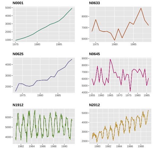<!-- --> ] .pull-right[ **Feature-domain representation** 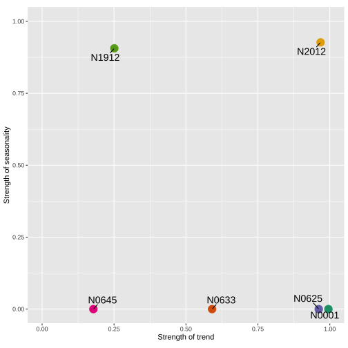<!-- --> ] --- ## References Talagala, T. S., Hyndman, R. J., & Athanasopoulos, G. (2018). Meta-learning how to forecast time series. Monash Econometrics and Business Statistics Working Papers, 6, 18.