class: center, middle, inverse, title-slide # Data Visualization ### Dr Thiyanga Talagala ### 2020 - 02 - 18 --- # Guidelines for effective data visualization Encoding: translating the data into a visual element on a chart/map/etc. <img src="encoding.png" width="500"> [Image credit: Stuart Hall’s 1973 “Encoding/Decoding” model.](https://towardsdatascience.com/why-you-should-try-mean-encoding-17057262cd0) --- # Encoding vs Decoding 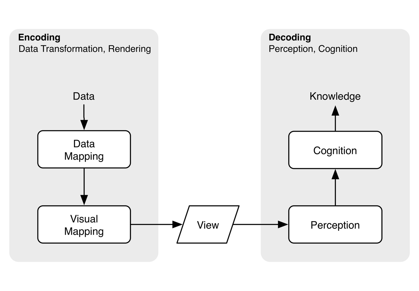 Read [here](https://eagereyes.org/basics/encoding-vs-decoding) --- ## 1. Simplicity - Colour - Increment: Use increments like (0, 2, 4, 6,..) instead of , say (0, 3, 6, 9,...) - Scale: Don't plot two unrelated series with one scale on left and one on the right. - Style: Flat and simple. No 3D effects, shadows, distracting shadings. - Set the baseline to zero.  --- ## 2. Type of encoding object and attribute used to create a plot - Encoding objects: points, lines, bars - Value-encoding attributes [to show different pieces of information]: point position, line length, color - everyone has different perceptions of visualizations but there are a few simple steps that everyone can follow.  .footer-note[.tiny[.green[Image Credit: ][Patrik Lundblad ](https://blog.qlik.com/visual-encoding)]] --- ## Which visual encoding method is best for you?  .footer-note[.tiny[.green[Image Credit: ][Patrik Lundblad ](https://blog.qlik.com/visual-encoding)]] --- ## Inappropriate encoding  .footer-note[.tiny[.green[Image Credit: ][Patrik Lundblad ](https://blog.qlik.com/visual-encoding)]] --- ## Appropriate encoding  .footer-note[.tiny[.green[Image Credit: ][Patrik Lundblad ](https://blog.qlik.com/visual-encoding)]] --- ## Select meaningful axis ranges - When absolute magnitudes are important, the vertical axis should begin at zero.  --- ## Data transformation - plotting on a logarithmic vertical axis can remove skewness in datasets with ranges that include very large and small values (Cleveland, 1994). .pull-left[ <!-- --> ] .pull-right[ <!-- --> ] --- # Graph aspect ratio - ratio of a graph's height to width <!-- --> .pull-left[ <!-- --> ] .pull-right[ <!-- --> ] --- # Overlapping points Plot overlapping points in a way that density differences become clear in scatter plots ### Method 1 .pull-left[ <!-- --> ] .pull-right[ <!-- --> ] --- # Overlapping points (cont.) ### Method 2 <img src="density.jpg" width="500"> --- ## Use lines when connecting sequential data in time-series plot --- ## Aggregate larger datasets in meaningful ways - Large quantitative dataset : box-and-whisker plots or through kernel smoothing strategies - Combination of quantitative and categorical: dotplots, or linked micromap plots - Pie charts should be avoided: difficult to perceive differences in angles - long time series: temporal aggregation, averaging values across a large time step ( eg: daily to monthly) ---  --- ## Maintain similar vertical or horizontal axis ranges across subplots <img src="range.png" width="500"> --- ## Select an appropriate colour scheme <img src="colorbrewer.png" width="500">