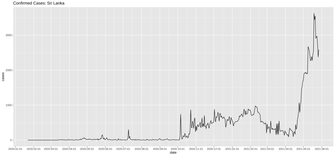
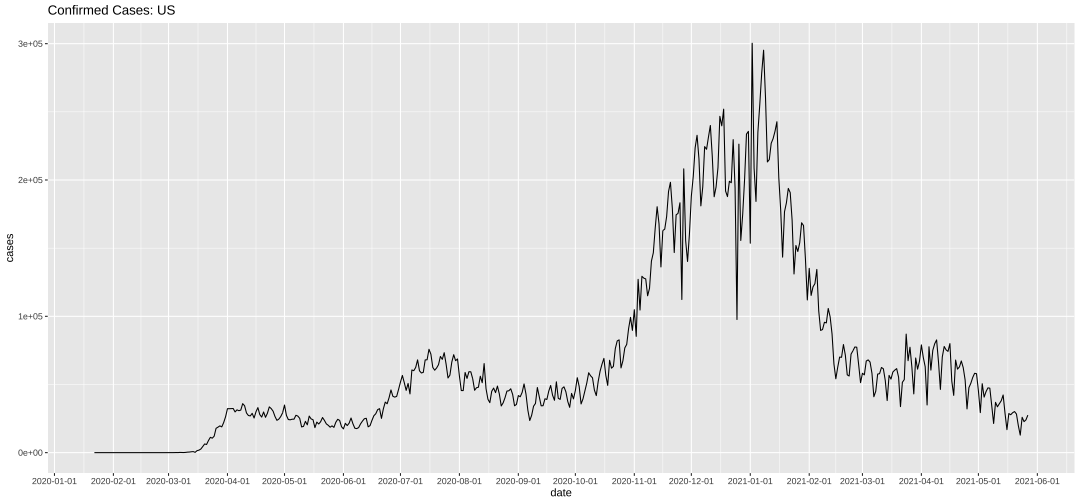
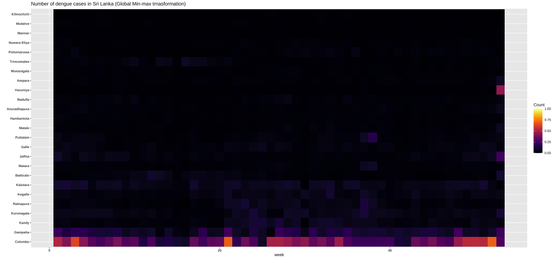
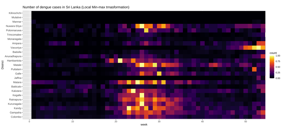
class: center, middle, inverse, title-slide # ASP 460 2.0 Data Visualization ### Dr Thiyanga Talagala ### 1. Introduction to Data Visualization: Design Process --- background-image: url('plot1.png') background-size: contain --- # What is data visualization? The visual representation and presentation of data to facilitate understanding. Andy Kirk --- # What is data visualization? The visual **representation** and **presentation** of **data** to **facilitate understanding**. Andy Kirk --- # What is data visualization? The **visual representation** and presentation of data to facilitate understanding. Andy Kirk- - How you are going to plot your data - Building blocks of charts - marks: points, lines or shapes to represent data - attributes: visual variations of marks: different scales, positions, sizes --- # What is data visualization? The visual representation and **presentation** of data to facilitate understanding. Andy Kirk- - Design decisions as a means for communicating to others - application of interactivity - features of annotations - legend, titles, scales, caption - dimentions of the chart area --- # What is data visualization? The visual representation and presentation of data to facilitate **understanding**. Andy Kirk- ## The three phases of understanding Perceiving --> Interpreting --> Comprehending - Three different cognitive focuses. --- # Perceiving - **What do I see?: Reading the chart** - What data is shown? - What is on x-axis/ y-axis? - What do colours represent? - What range of values are displayed? - stepped magnitude judgement? - Where are the least and most/ average?/largest and smallest? --- <!-- --> --- # Interpreting - Translate what you see into quantitative and/or qualitative meaning. - Reader's ability to perform relational interpretation - Are these patterns normal, expected or unusual? - What features are interesting? - What features are important given the subject knowledge? - If you do not have any knowledge about the subject your understanding stops after the perceiving phase. --- <!-- --> --- <!-- --> --- # Comprehending - What does it mean to me? - What does one do with this understanding? - Have I learned something I did not know before? - Was it confirmed I did not know before? --- <!-- --> --- <!-- --> --- # What is data visualization? The visual representation and presentation of data to **facilitate** understanding. - Visualisers can control the output but not the outcome. --- ## Perceiving: What does it **show**? ## Interpreting What does it **mean**? ## Comprehending What does it **mean to me**? --- ## The Visualisation Design Process - In visualisation there is no such thing as perfect solution. ### Challenges - Whether it will be understood as you wish - Plots which are common in one kind of field may be unfamiliar to the readers of another research field. - Choice of graphical form: The same data may be plotted in many alternative ways, which is best and why? - May look different in print than on a computer screen. - Other limitations: time, tools, demand of different audiences --- ## Organising your thinking: What, for whom, why - Stage 1: Formulating your brief - Stage 2: Working with data - Stage 3: Establishing your editorial thinking - Stage 4: Developing the design solution --- ## Stage1: Formulating your brief - Planning: - What is the output format? (printout, mobile app, etc) - Audience (How much assisstant do they need?, How familiar are they with the charts?) - Time scale - Tools --- ## Stage1: Formulating your brief (cont) - Purpose: - Exhibitory - Explanatory - Exploratory --- background-image: url('e1.png') background-size: contain # Exhibitory --- background-image: url('e2.jpg') background-size: contain # Explanatory --- background-image: url('e3.png') background-size: contain # Exploratory --- ## Stage 2: Working with data - Gathering, handling and preparing your data - Qualitative vs Quantitative - Nominal, Ordinal, Interval, Ratio - Minimum, Maximum, Number of Categories --- ## Stage 3: Establishing your editorial thinking - What questions are you trying to answer in support of the overriding curiosity? - Selecting items to include or exclude --- ## Stage 4: Developing your design solution - Scales - Simplicity - Granularity: relative size, scale, level of detail - Coverage - Sorting and ordering - Annotation (Overlaying information) - Highlight particular feature of a graphic - Guides the reader - Emphasizing particular issue - Overlaying (Statistical) information - Challenge: overlapping or cluttered display --- ## Stage 4: Developing your design solution (cont.) - Captions, legends - Positioning/ layout: Same page or in the facing page, inconvenient to have to turn pages back and forth - Size, Frames and Aspect Ratio - Colour: Blends well and distinguish between different categories - Consistency - Proximity: place graphics on the same page or on the facing page --- ### Three principles of good visualisation design (From Andy Kirk) - **Trustworthy:** Is it reliable? - **Accessible** Is it usable/ understandable? - **Elegant** --- background-image: url('charts-scale.jpg') background-size: contain --- background-image: url('mis.jpeg') background-size: contain --- background-image: url('election3.png') background-size: contain --- background-image: url('election2.gif') background-size: contain --- background-image: url('election.png') background-size: contain --- class: center, inverse # Exercise Sketch suitable plots to visualize the frequency distribution. --- **US Adults Opinions on Climate Change Relevant Regulations** 1. Require producing 20% of electricity from clean energy 2. Regulate `\(CO_2\)` as a pollutant 3. Fund more research into renewable energy | | 1 | 2 | 3 | 4 | 5 | |-----|-----|-----|-----|-----|-----| | Q1 |15 | 20 | 2 | 38 | 25 | | Q2 | 10 | 14 | 2 | 44 | 30| | Q3 | 6 | 9 | 2 | 41 | 42| Response: Strongly support (1), Somewhat support (2), Refused (3), Somewhat oppose (4), Strongly opposed (5) --- class: center, inverse Acknowledgement Kirk, A. (2016). Data visualisation: a handbook for data driven design.