class: center, middle, inverse, title-slide .title[ # ASP 460 2.0 Data Visualisation ] .subtitle[ ## Visualizing Distributions ] .author[ ### Thiyanga Talagala ] --- # Visualizing a Single Distribution - Histogram - Density plot - Cumulative density - Quantile-Quantile plot > Cumulative density and Quantile-Quantile plot are hard to interpret. --- # Visualizing multiple distributions .pull-left[ **Visualization of distributions along the X-axis** - Boxplots - Violins - Strip charts - Sina plots ] .pull-right[ **Visualization of distributions at the same time** - Staked histograms - Overlapping densities - Ridgeline plot ] --- # Histogram - Binwidth 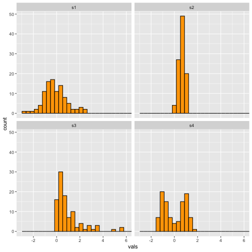<!-- --> --- # Histogram-Binwidth (.1) **Narrow** 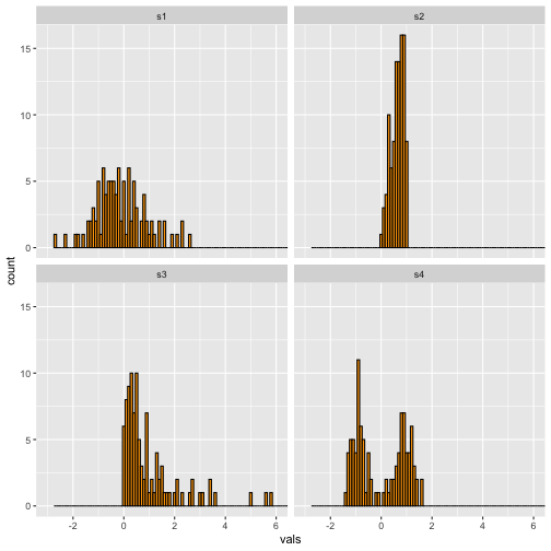<!-- --> --- # Histogram-Binwidth (2) **Wide** 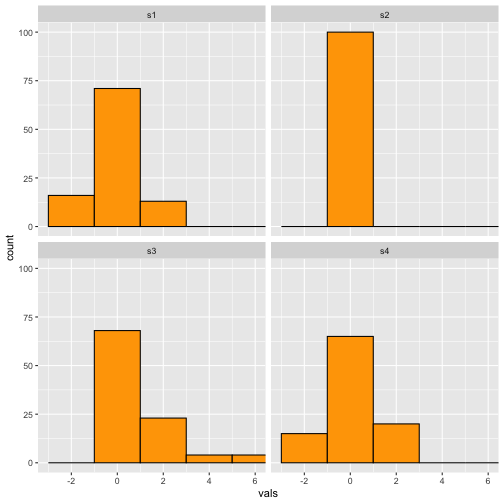<!-- --> --- # Add a rug 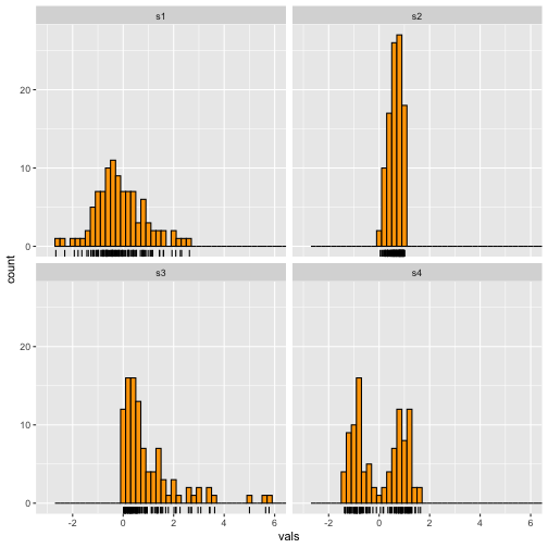<!-- --> --- # Histogram - Example ```r ggplot(iris, aes(x = Sepal.Length)) + geom_histogram(binwidth = .2, fill = "orange", colour = "black") + geom_rug() + facet_wrap(~ Species) ``` <!-- --> --- # Boxplot **Medium to Large N** <!-- --> --- # Boxplot - Example ```r ggplot(iris, aes(y = Sepal.Length, x = Species)) + geom_boxplot() ``` <!-- --> --- # Add notches “Notches are used to compare groups; if the notches of two boxes do not overlap, this is strong evidence that the medians differ.” (Chambers et al., 1983, p. 62) <!-- --> --- # Boxplot with notch - Example ```r ggplot(iris, aes(y = Sepal.Length, x = Species)) + geom_boxplot(notch = T) ``` <!-- --> Your turn: Perform ANOVA. --- # Add summary statistics <!-- --> Green: Mean --- # Boxplot with summary - Example ```r ggplot(iris, aes(y = Sepal.Length, x = Species)) + geom_boxplot() + stat_summary(fun.y=mean) ``` <!-- --> --- # Boxplot with summary - Example Your turn: Add min, max, Q1, Q2, Q3 <!-- --> --- # Stripchart **Small to Medium** <!-- --> --- # Stripchart - Example <!-- --> --- # Boxplot using geom_dotplot **Small to Medium** .pull-left[ <!-- --> Previous ] .pull-right[ <!-- --> Now ] --- # Boxplot using geom_dotplot - Example .pull-left[ ```r ggplot(iris, aes(x = Species, y = Sepal.Length)) + geom_dotplot(stackdir = "center", binaxis = "y", binwidth = .1, binpositions = "all", stackratio = 1.5, fill = "#7570b3", colour = "#7570b3") ``` 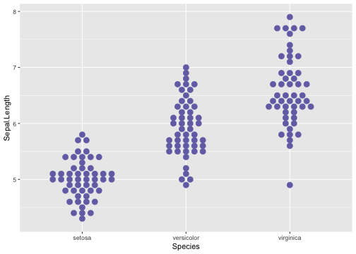<!-- --> ] .pull-right[ ```r ggplot(iris, aes(x = Species, y = Sepal.Length)) + geom_dotplot(stackdir = "center", binaxis = "y", binwidth = .05, binpositions = "all", stackratio = 1.5, fill = "#7570b3", colour = "#7570b3") ``` 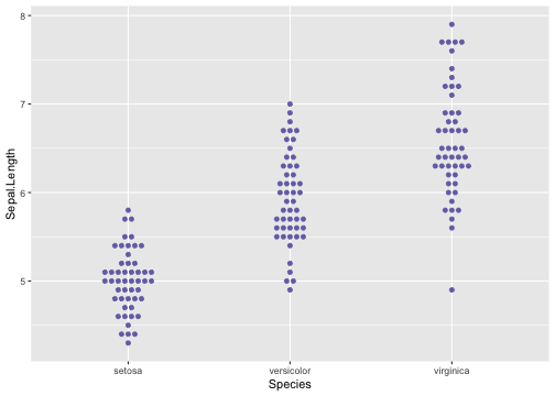<!-- --> ] --- # Bee swarm  --- # Beeswarm .pull-left[ <!-- --> Previous ] .pull-right[ 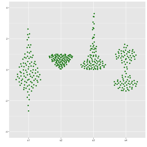<!-- --> Now ] --- # Boxplot with dot points 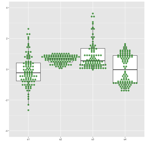<!-- --> --- # Boxplot with dot points - Example ```r ggplot(iris, aes(y = Sepal.Length, x = Species)) + geom_boxplot(outlier.shape = NA) + geom_dotplot(binaxis = 'y', stackdir = 'center', fill = "#7570b3", colour = "#7570b3", binwidth = .05) ``` 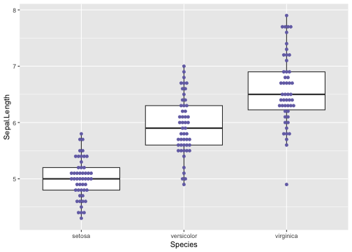<!-- --> --- # Boxplot with dot points .pull-left[ 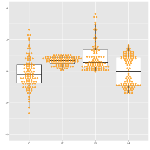<!-- --> Previous ] .pull-right[ 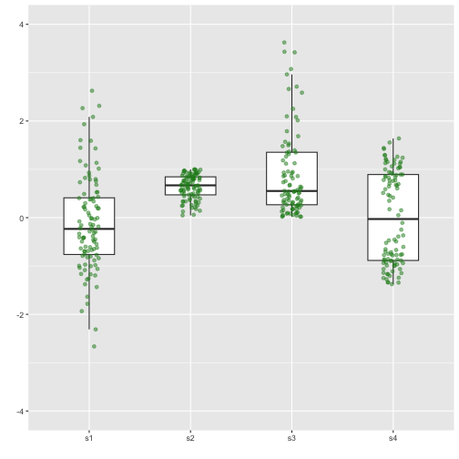<!-- --> Now with `geom="jitter"` ] --- # Boxplot with dot points (geom="jitter") ```r ggplot(iris, aes(y = Sepal.Length, x = Species)) + geom_boxplot(outlier.shape = NA, width = .5) + geom_jitter(fill = "#7570b3", colour = "#7570b3", position = position_jitter(height = 0, width = .1), alpha = .5) ``` 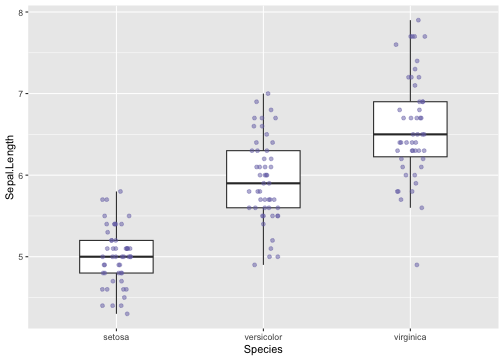<!-- --> --- # Density plots **Medium to large n** <!--More recently, as extensive computing power has become available in every devices such as laptops and cell phones, we see them increasingly being replaced by density plots.--> <!--attempt to visualize the underlying probability distribution of the data by drawing an appropriate continuous curve--> 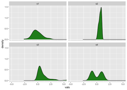<!-- --> --- background-image: url('kernel1.png') background-position: center background-size: contain --- background-image: url('kernel2.png') background-position: center background-size: contain --- # Density plot .pull-left[ 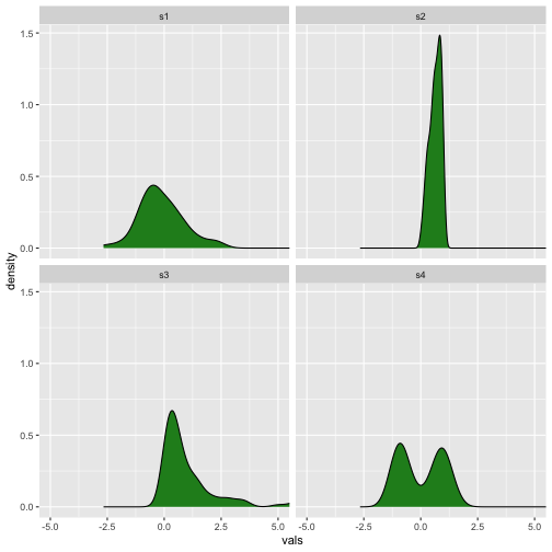<!-- --> Previous ] .pull-right[ 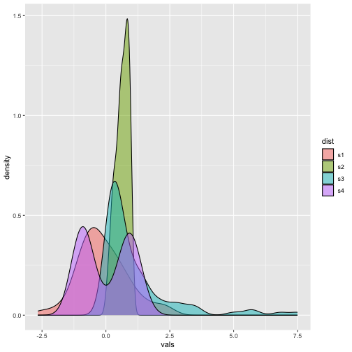<!-- --> Now ] --- # Density plots - Example .pull-left[ ```r ggplot(iris, aes(x = Sepal.Length)) + geom_density(fill = "#7570b3") + facet_wrap(~ Species) ``` 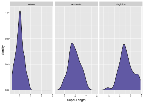<!-- --> Previous ] .pull-right[ ```r ggplot(iris, aes(x = Sepal.Length, fill=Species)) + geom_density(alpha=0.5) ``` 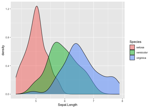<!-- --> Now ] --- # Density plot and Histogram .pull-left[ <!-- --> Previous ] .pull-right[ 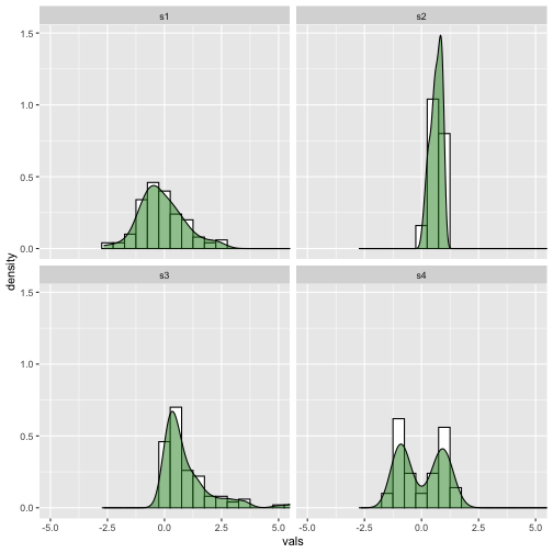<!-- --> Now ] --- # Density plot and Histogram - Example ```r ggplot(iris, aes(x = Sepal.Length)) + geom_histogram(aes(y = ..density..), binwidth = .5, colour = "black", fill = "white") + geom_density(alpha = .5, fill = "#7570b3") + facet_wrap(~ Species) ``` <!-- --> --- # Violin plot .pull-left[ <!-- --> Previous ] .pull-right[ <!-- --> Now ] --- # Violin plot - Example ```r ggplot(iris, aes(x = Species, y = Sepal.Length)) + geom_violin(color = NA, fill = "#7570b3", na.rm = TRUE, scale = "count") ``` <!-- --> --- # Violin plot + Boxplot .pull-left[ 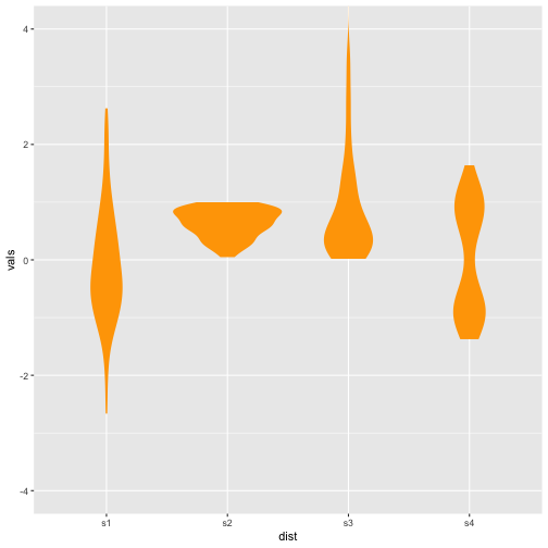<!-- --> Previous ] .pull-right[ 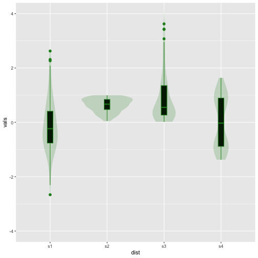<!-- --> Now ] --- # Violin plot + Boxplot ```r ggplot(iris, aes(x = Species, y = Sepal.Length)) + geom_boxplot(outlier.size = 2, colour="#7570b3", width=.1) + geom_violin(alpha = .2, fill = "#7570b3") ``` 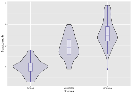<!-- --> --- # Ridgeline plots .pull-left[ 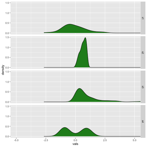<!-- --> Previous ] .pull-right[ <!-- --> Now ] --- # Ridgeline plots - Example ```r library(ggridges) ggplot(iris, aes(x = Sepal.Length, y = Species)) + geom_density_ridges(scale = 0.9, fill = "#7570b3", alpha = .5) ``` <!-- --> --- # Raincloud plot .pull-left[ <!-- --> Previous ] .pull-right[ <!-- --> Now ] --- # Raincloud plots - Example ```r library(ggridges) ggplot(iris, aes(x = Sepal.Length, y = Species)) + geom_density_ridges(scale = 0.9, position= "raincloud", jittered_points = TRUE, fill = "#7570b3", alpha = .5) ``` 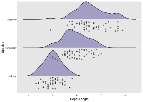<!-- -->